Below are some paintings from a very short (weekend) trip to Tuscany. Since I had so little time to paint I chose only subjects that were backlit, i.e. had the sun behind them.
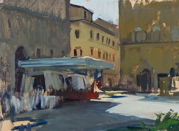
Market Stall in Piazza Santo Spirito. 25 x 35 cm, oil on panel.
It’s probably different for every painter, but I find I can work much faster and get better results when painting towards the sun. It becomes much more about drawing and values. Frontlit subjects require a painter to capture every small nuance in hue and chroma which, for me, takes much longer.
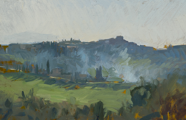
Burning Leaves, Montisi. 20 x 30 cm, oil on panel.
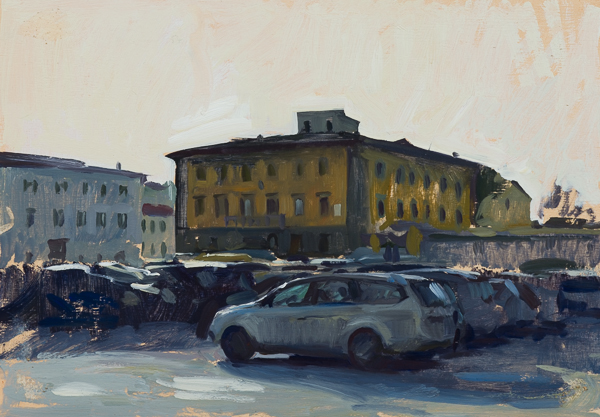
Piazza del Carmine. 25 x 35 cm, oil on panel.
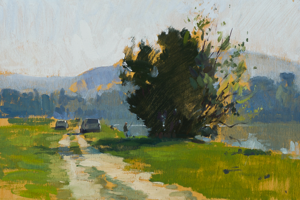
Fishermen on the Banks of the Arno. 20 x 30 cm, oil on panel.
It’s interesting to look at historic landscape painters and their preference for lighting in their views. For example, the Spanish painter Carlos de Haes went for the backlit subject in many of his plein air and studio landscapes.
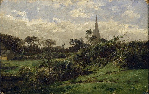
Carlos de Haes -La Torre de Douarnenez
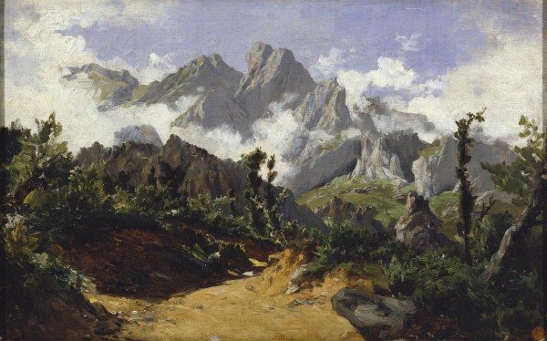
Carlos de Haes – Picos de Europa.
And Camille Corot’s best works are usually backlit:
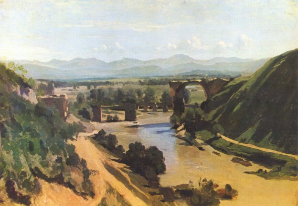
Camille Corot – The Bridge at Narni.
As are Dennis Miller Bunker’s:
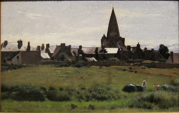
Dennis Miller Bunker – Brittany Town Morning.
The French Impressionists were also big on the midday backlit view, which is surprising since their draftsmanship wasn’t the best and they seemed so focused on color.
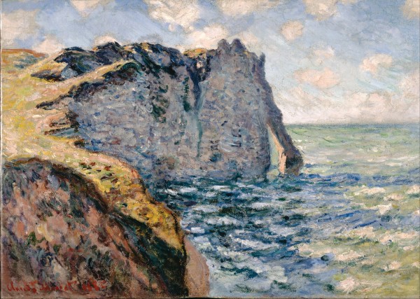
Claude Monet – The Cliff of Aval.
On the other hand, the Spanish painters Joaquín Sorolla and Martín Rico y Ortega seemed to love the bright whites, dark skies, and strong hues of frontlit subjects in Spain and Italy. And the Italian painter Rubens Santoro painted some amazing sunlight-filled views of Italy which are also often frontlit.
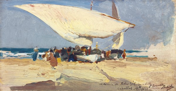
Joaquín Sorolla y Bastida – The Return of the Catch, Valencia Beach
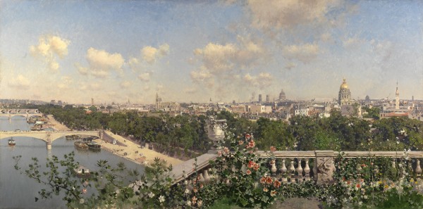
Martín Rico y Ortega – View of Paris from the Trocadero.
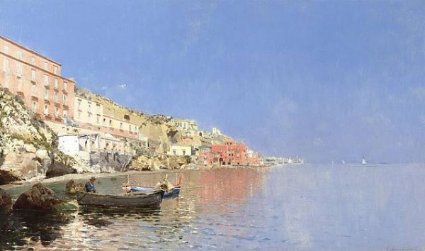
Rubens Santoro – On the Mediterranean Coast
Isaac Levitan’s best paintings are usually frontlit (or overcast).
Isaac Levitan – March.
And finally, on the other side of the world, the great Australian painter Arthur Streeton also used the frontlit view often to show the heat of the Australian summers.
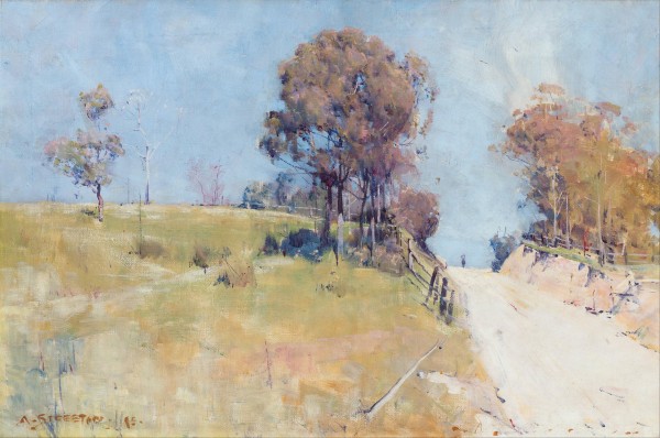
Arthur Streeton – Sunlight.
Obviously, all of these great artists tried to capture a wide variety of light effects in their paintings. Still, looking over a single painter’s oeuvre, it’s fun to try to discern a pattern. Some of the other great landscape painters I (briefly) researched for this post were John Singer Sargent, Telemaco Signorini, and Edward Seago, but I wasn’t able to see any preference in their work (even Sorolla was a bit of a stretch).
Fantastic work as always Marc!
I usually run into a practical problem with back lit scenes, and that is the sun in my face! I have been able to angle my canvas to block the sun sometimes, but that is not always possible. Do you have any strategies for that?
Hi Marc,
Another plein air painter who makes superb contra jour paintings is the legend Ken Howard RA. I think he’s in his early 80’s now and still going strong. I find that wearing a cap with a brim is essential to avoid being dazzled when painting backlit subjects.
Excellent site Marc !
Great post, thanks so much!
Its funny you say that… i know that Dennis bunker could draw circles around any artist today.
Thanks for more education.
Yes, how do you discern the correct colour is on the brush when you are staring towards the sun?
.
Hi Oliver, I wear a cap and use the panel as shade. If I’m painting on canvas I often put a sheet of cardboard in the back so the sun doesn’t shine through.
The sketch at Santo Spirito is brilliant…among others of course!
Another 19th century painter who materfully used front-lit lighting for many of his forest scenes was Ivan Shishkin, but I couldn’t say it was something he favored over other lighting angles, since he seemed to be able to master them all.
Nice post, Marc.
Bill
like you I love vibrant colour so out of your generous library I choose your work and Corot one. In both I love their simplicity.
I never manage to do as dark green as you do, is it really only ultramarine and ochre??
Thanks Monique. I use Old Holland’s Utramarine dark. It’s the only one that gets dark enough. I usually mix greens with cadmium yellow, ochre has too much chalkiness to it. (Some cadmium red medium helps darken the color too).
A clamp on plein air umbrella does the trick for me when painting into the sun