Photographing paintings

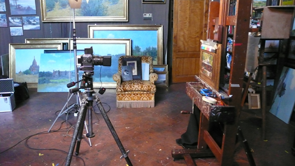
The set-up.

The set-up.

This week I had a professional photographic studio (Industrial Foto) come to photograph my latest paintings for a catalog. It was interesting to see their set up, and the results are so much better than what I can do with my Panasonic Lumix LX2. It was very expensive though, for a little more money I could have bought a new entry level DSLR. The photographers used a Hasselblad 555 ELD with an Imacon ixpress digital back. They explained that the cameras need to be upgraded less often than the digital processors, so this way they can upgrade each separately. The whole thing was hooked up to a Macbook Pro and everything was done from the computer (checking the light and releasing the shutter) with the proprietary Imacon software.
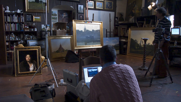
Industrialfoto running the shoot from a Macbook

Industrialfoto running the shoot from a Macbook

They used artificial light and some of the photos came out with a yellow tint. I can color correct them myself but I would have preferred to work from the RAW camera files rather than the TIFFs they sent me.

For the internet the high-resolution photos really don’t make much of a difference, here is a side by side comparison between my little Panasonic and their system:
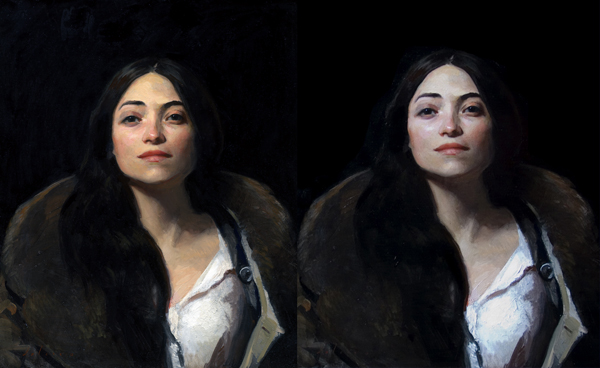
The Hasselblad is on the left, my Panasonic is on the right.

The Hasselblad is on the left, my Panasonic is on the right.

Open studio

My 15 minute attempt at graphic design.

Leo and Josh with the model.

On Friday April 17th, Greg, Josh, Leo and I will be having an open studio in our beautiful 19th-century painting studio in Piazza Donatello. Everyone is welcome. You can pop by during the day to beat the crowds if you like, but let someone know you’re coming. Otherwise we’ll have fine wine and even better art from 18:00 onwards.

Ironing things out

Traveling around, I occasionally get dents or scratches in my canvases. On a small ding, usually just wetting the back slightly on the deformed spot is enough to stretch the linen back into place*. Recently however I had a long line appear on a commissioned painting which was almost finished (something probably leaned on it in my car). As the painting was done for the most part in the fall, I would have had to wait half a year to paint it again.

Instead I had a professional restorer, Daniella Murphy Corella, come by the studio and take the painting to be ironed. I ended up doing all the work myself under her guidance and I’ll share what I learned.

First off I used a regular household iron. The iron must be able to operate at lower temperatures, i.e. you can place your hand on it without burning yourself (do this carefully). If your iron doesn’t go to just ‘warm’ you can put newspaper between it and the canvas.

Second, you take out all the water from the iron and make sure it doesn’t steam the canvas.

Third,  you unstretch the canvas and place it with the painting side down on silicon paper or something that the paint wont stick to.

Then you iron the canvas on the back where the problem area is for a very long time. I probably ironed for over an hour total, applying pressure the whole time. At the end the line was gone and the canvas wasn’t deformed in any way by the low heat. Apparently, if you use high heat (or water), the canvas will get waves in it which makes things much worse.

*One note about wetting the back of the canvas to get rid of dings. In my experience, if it doesn’t come out the first time you wet the canvas, don’t try it a second time or the ground can crack.

My Palette


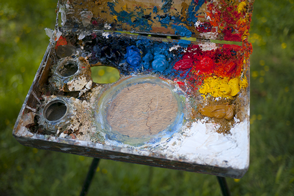
My ultra-portable cigar box palette.

My ultra-portable cigar box palette.

I’ve been asked a few times lately what my palette is, so I thought I’d put a post about it.

(Updated in 2020:)

Outside:

  • Titanium white, from either Williamsburg.
  • Cadmium Yellow Light from Williamsburg.
  • Cadmium Yellow Medium from Williamsburg.
  • Zecchi’s Roman Ochre.
  • Cadmium Red Light (Vermilion substitute), from Williamsburg.
  • Cadmium Red Medium from Williamsburg.
  • Cadmium Orange from Williamsburg.
  • Cerulean Blue, Williamsburg, Zecchi, or Old Holland if I’m felling flush.
  • Ultramarine Deep from Old Holland.
  • Cobalt Blue, either Old Holland, Williamsburg or Zecchi.

Inside I use Lead White, and  Ivory Black for portraits and still life.

Sometimes I glaze my landscapes or portraits with Alizarin, from Williamsburg.

The palette I started with included Naples Yellow, an earth red (Pozzuoli, English…etc), and Veridian. I have also used high chroma purples for specific projects with irises and such.