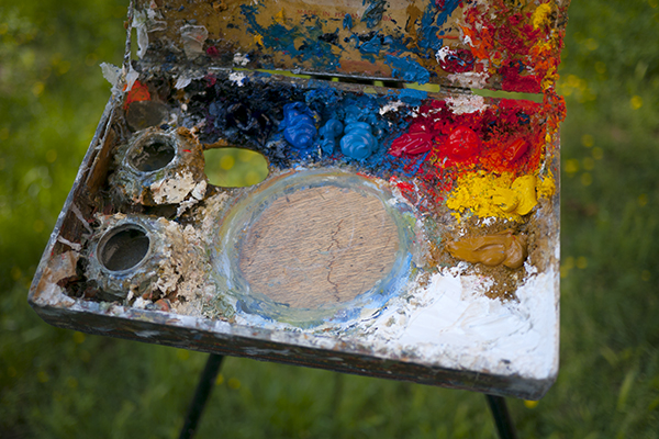
My ultra-portable cigar box palette.
I’ve been asked a few times lately what my palette is, so I thought I’d put a post about it.
(Updated in 2020:)
Outside:
- Titanium white, from either Williamsburg.
- Cadmium Yellow Light from Williamsburg.
- Cadmium Yellow Medium from Williamsburg.
- Zecchi’s Roman Ochre.
- Cadmium Red Light (Vermilion substitute), from Williamsburg.
- Cadmium Red Medium from Williamsburg.
- Cadmium Orange from Williamsburg.
- Cerulean Blue, Williamsburg, Zecchi, or Old Holland if I’m felling flush.
- Ultramarine Deep from Old Holland.
- Cobalt Blue, either Old Holland, Williamsburg or Zecchi.
Inside I use Lead White, and Ivory Black for portraits and still life.
Sometimes I glaze my landscapes or portraits with Alizarin, from Williamsburg.
The palette I started with included Naples Yellow, an earth red (Pozzuoli, English…etc), and Veridian. I have also used high chroma purples for specific projects with irises and such.