Ultralight Plein Air Landscape Painting Part II

This is an update to a post from a few years ago. I’ve been interested in developing a lightweight set-up for plein air painting and I feel I’ve finally achieved my goal. At the moment my backpack with gear for a day of plein air painting has a base-weight of around 8lbs, or under 4kg. For painting in rain, at night, or if I’m expecting variable weather I can add equipment as needed.

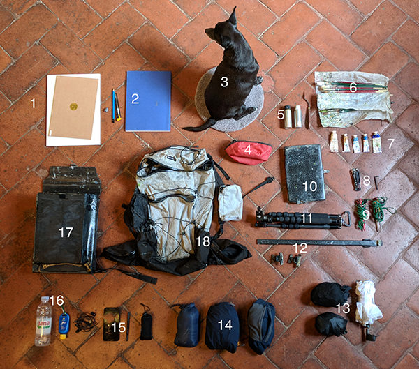
You can see the set-up in the images below:

Ultralight plein air painting set up.

My ultralight plein air painting kit.

Ultralight plein air landscape painting set-up with everything open.

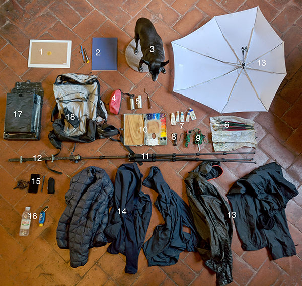
My kit with everything opened.

Ultralight backpack for plein air landscape painting.

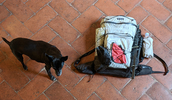
Everything in the backpack. Small dog for scale.

Here is the key for the numbers, with hyperlinks (some are referral):

  1. Foam-core panels with mounted linen.
  2. Drawing materials: Sketchbook, pencil, blade for sharpening, kneaded eraser.
  3. Small dog.
  4. Water bowl for the dog.
  5. Medium, thinner, and palette knife.
  6. Brushes (Zecchi series 102 sables and Cornelissen series 44 bristles).
  7. Extra blues, titanium white and Roman ochre.
  8. Multitool and allen key.
  9. Tent pegs.
  10. Custom carbon fiber pochade box.
  11. Sirui t-025x tripod. (The Sirui 5C is the same but newer and cheaper. I have both).
  12. Custom carbon fiber mast and panel clips.
  13. Rain pants, rain jacket, and umbrella with home-made attachment (situational).
  14. Down jacket, fleece, and windbreaker (situational).
  15. Phone, headphones, backup battery and stylus.
  16. Water and sunblock.
  17. Custom carbon fiber panel holder (takes two sizes).
  18. KS Ultralight backpack.

Most of my gear is normal painting equipment but I’ll go over some of the things.

1. New Traditions Gatorfoam panels with Claessens linen work very well. The glue never comes undone, even if the panels are left in a car window in August (I’ve tried it).

2. Kunst & Papier sketchbooks have the best paper of any I’ve found, and the paper binding makes them lighter than hardcover sketchbooks.

5. I use a Canada balsam/sun-thickened linseed oil mix for my medium, and lavender essence for my thinner. These aluminum bottles aren’t great as they start to leak after a year or so. I’m still on the lookout for a better system.

6. My set-up would be much lighter if I could learn to use fewer brushes. There are some very good painters out there who use one or two brushes for an entire oil painting. I don’t know how they do it.

7. Cadmium paints last a week on my palette, so I only bring tubes of the three blues I use (cobalt, ultramarine, cerulean), ochre, and titanium white. I go through a lot of those colors.

8. I probably use the Leatherman Skeletool once a year, and most times don’t carry it. Same with the allen key, once I get the proper tightness on the legs of the tripod I don’t really need it.

9. Most of the time the weight of the backpack and a water bottle is enough to keep the easel steady while I paint. In high winds the tent pegs work great. If I can’t get them into the soil I tie them to rocks or even lampposts or signposts in cities.

10. My next blog post will be on making a custom carbon fiber pochade box, mast set-up, and panel carrier (#12 and #17).

11. The Sirui t-025x tripod is the lightest tripod I could find that had decent stability and got up high enough for painting equipment.

13. For a rain jacket I really like the new Gore-Tex Shakedry jackets as they still breath even when you’re drenched in heavy rain. My previous jackets would ‘wet out’, meaning the face fabric would get soaked with water and keep the membrane from breathing, and the jacket would feel stuffy and suffocating in warm rain. This one breathes so well that I’ve even worn it in the summer as a bug jacket. The downside to the Arc’teryx version that I have is that the zipper leaks in really heavy rain. Other brands make them with better zippers. My umbrella is a Senz storm umbrella with a custom attachment that I made for the mast of my easel. It keeps the rain off of the painting and the palette, but unfortunately dumps it onto me while I work.

14. For carried clothes, the fleece/down/windbreaker jacket combo works great. Obviously I only take what I think I’ll need, but for shoulder seasons and places where the temperature can change dramatically (cough * the California coast * cough) the three layers give me a lot of versatility. Also, the dog gets cold quicker than I do, so she usually sleeps wrapped in one of the layers. In the past I carried a down vest rather than a jacket and I think vests are great for painters as allows for more mobility with our painting arms. And on the subject of shoulder mobility, climbing clothes are usually stitched differently so the sleeves can be raised easily. I find they work better than city or street clothes with the sleeves stitched in the ‘arms down’ position where you fight the fabric to raise your arm. It’s not a huge deal, but something to consider. All my shirts, jackets, and hats are black, dark grey, blue or dark blue so as to not reflect a confusing color back onto my painting when working contre-jour.

15. My current phone is a first generation 5″ Google Pixel. I wanted the larger storage (128GB) for shooting video while I travel, a high quality camera, and I prefer a headphone jack to the bluetooth-only design of newer phones. A powerbank is very useful for charging my phone when I forget to charge it at home, and the stylus works as a backup pencil if I need to sketch. In reality I almost never use it.

18. The KS Ultralight backpack works very well, but it’s not 100% waterproof. My worry with backpacks is that my medium will leak out, not that water will get in, so I’ve added an inner liner to the outer pocket where my pochade box goes.

This is still a work in progress, but I have arrived at a point where I don’t feel I can improve on anything in particular for the moment. Everything works great, and weighs as little as possible. My next goal is to get a similar set-up for carrying and working on very large plein air landscapes and I’ve almost got that working as well, so stay tuned.

On Green

Plein air figurative painting from Gregurić Breg

Gregurić Breg. 100 x 80 cm (40 x 32 inches), oil on linen.

Three different people have written to ask me to clarify my video on mixing greens for plein air landscape painting lately. Apparently I mumble. So here it is again, written down, my mixes and recommendation for greens.

First off, I should mention that there are many people whose opinions I highly respect that think my greens are terrible. Acidic, garish, too bright, too yellow, etc… That said, I try to honestly paint what I see and I like my greens. I was always partial to the story of John Constable who, when painting at a time when artists would cover their finished paintings with brown violin varnish to make them look Old Mastery, took a violin and laid it on the bright green grass to show the difference between the accepted pictorial norms of his contemporary artists and the colors of real life.

Secondly, I only mix my greens, so I don’t use viridian. I’ve tried putting it down on my palette but I end up never using it. However, it was on Gammell’s recommended landscape painting palette and you can see it in the work of many of the best painters so, if you like it, you’re in excellent company.

There are two blues and two yellows on the palette I was taught to use: Cerulean blue is a greenish blue, ultramarine is a purplish blue, cadmium yellow light is a pure, bright yellow, and Roman (or golden ocher) is a dirty yellow.

With these four colors you can get four different greens:

  • For a light, spring green (grass, or light coming through leaves as in the painting shown) I use cerulean and cadmium yellow. This is the bright, acidic green. Adding white or a touch of red or ocher is often useful to knock the chroma down.
  • For the dark greens in the shadows, I use ultramarine and cadmium yellow. Even though the ocher looks darker, the chalkiness of it will make a lighter green. Cadmium yellow gets a rich dark shadow green. I’ll add cadmium red medium to darken it even more.
  • My favorite foreground or middle-ground ‘tree’ green is cerulean and ocher. It gets the perfect color of cypress or oak trees in sunlight. More ocher if it’s late afternoon or sunset.
  • The last possible green is ocher and ultramarine, it gives a grey, chalky green which I almost never use for foreground or middle-ground greens. I’ll sometimes use it as a base color for olive trees. On the other hand it is very useful for distant tree-covered mountains.

The brand of paint is very important for getting the right colors.

  • For cerulean blue, Old Holland makes the best one but it is outrageously expensive. For less important projects, Williamsburg or most other brands are just as good.
  • Ultramarine Blue Deep by Old Holland is the only functional ultramarine I’ve found. It’s better than hand-ground ultramarines and is probably the one absolutely essential color on my palette.
  • In my opinion, Williamsburg makes the best cadmium colors and their cadmium yellow light is perfect. Lately I’ve been using both their cadmium yellow light and cadmium yellow medium to vary my bright greens a bit.
  • Zecchi’s Roman Ocher is the best yellow ocher I’ve used, though Old Holland’s golden ocher is a similar hue (if a bit stiff to work with, and slightly cooler).

Lately I’ve started using cobalt blue (any brand), but I don’t have any clever green mixes with it to speak of. I mostly use it for skies, shadows, or to mix a quick grey with cadmium orange.


Williamsburg in Florence

Williamsburg Paint Image

Williamsburg makes some of the best tube paints (in my opinion). And finally, after years of my badgering, Zecchi in Florence is selling some of Williamsburg’s better colors.

Their cadmium colors are as good as anything I ever ground myself. Their cadmium red light, for example, is the best warm vermilion substitute I’ve found. It reminds me of the older, real vermilion pigments I learned to grind paint with. Their other cadmiums (red medium, yellow light and medium, and orange) are all staples on my palette. They have beautiful hues and, because of their great tinting strength, one tube will last a long time. Cheaper paints usually have a lot of filler in them, so you go through the tubes much quicker as changing a color will require much more paint.

Their cerulean is beautiful -not Old Holland beautiful, but half the price. Their cobalt blue is also good, though it seems hard to botch a cobalt blue, I’ve never used a bad one.

Not all of their colors are great. For ochres I prefer Old Holland’s golden ochre or Zecchi’s own Roman ocher.  I also find the Williamsburg ultramarine totally unusable, Old Holland’s ultramarine dark is much, much better.

Williamsburg’s ivory black is the closest to hand-ground that I have found, though it is still a touch lighter. They sell a flake white too, but hand-ground lead white is really essential to good studio painting.

In 2010 Williamsburg was bought by Golden, the acrylic paint company, hopefully nothing will change.

Brushes

A short post on brushes.

My arsenal.

Cornelissen in London makes the best bristle brushes I’ve ever owned. They finally have an online store which is great, as getting to central London is a pain and their staff aren’t particularly friendly (I got in trouble there once for checking unfamiliar turpentine brands for mineral spirits and the clerk thought I was getting high). The series 44 are the ones I use. They are more expensive than other brands but they are built like tanks and last forever. Mine usually get worn down to a triangle shape after years of use.

For sables, Zecchi has the best quality brushes I’ve found. The red-handled ‘cat-tongue’ sables are very useful for drawing with your paint. They are also pricey (though cheaper than much of the competition), but will last a long time if properly looked after.

I get asked a lot about brush care. I clean mine about once a week with soap and cold water*. In the meantime I keep them in the freezer at night so they wont dry out.

Bristle brushes I wrap individually with a little piece of paper towel to pull out the water and keep the shape. Sables I leave a bit of soap in and make a point with the hairs so they dry with a sharp tip.

*It’s important to use cold water as warm water can expand the ferrule of the brush and the hairs will come out.

Blaming the Materials

Here are a couple of sketches from my plein air workshop near Volterra. The first I’m happy with, the second is awful.

San Giusto, Volterra. 20 x 30 cm, oil on panel.

San Giusto, Volterra. 25 x 35 cm, oil on panel.

The sketch above isn’t my fault. Really. Every month I make dozens of sketches and I usually buy large quantities of the gessoed boards from Zecchi. A few months back I got a batch from them where their subcontractor had messed up the proportions of the gesso and there wasn’t enough glue. The boards are too absorbent and are utterly unusable. Somehow they got mixed up into the next batch of boards I ordered and every now and then I find I’m trying to paint on one. It is impossible for me to pull anything decent off with one of these boards. I’ve had to throw away the ten or so paintings from the times I’ve insisted on trying.

On our workshops we give the students a full painting kit. It makes it easier for those who have to travel, but the reason we do it is really that we got tired of students arriving with unusable materials. Rubens couldn’t paint with some of the set-ups these people arrived with. Often they don’t have the experience to recognize that it’s their materials that are the problem. Since we started giving out full kits, we’ve seen a marked improvement in the students paintings. They are able to focus on learning to paint.

Good quality painting materials don’t have to be expensive either. Here in Florence we find the Zecchi brand is fine for paints (for dark ultramarine we use Old Holland). In the US, Blue Ridge and M. Graham both make excellent paint for reasonable prices. Often ‘student-grade’ paints are so full of fillers that to change one color you have to add a ton of the other one. This means the cost savings is gone when you calculate how much paint you actually have to use.

Good boards are cheap. Ray Mar is a good supplier in the US, Zecchi in Europe (when they get them right), or make your own. I use a cigar-box clipped to a $50 easel for most of my sketches. Brushes are really important but they don’t have to be expensive and will last for years if looked after properly. There is no excuse to skimp on materials if you care about painting.

At the end of the day, painting is hard enough without fighting your materials.