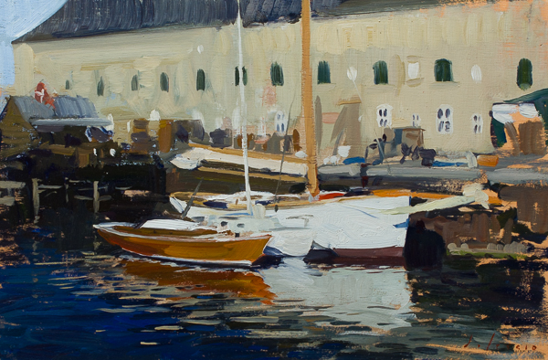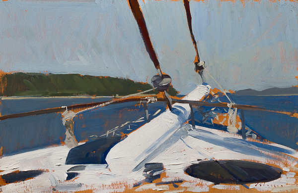
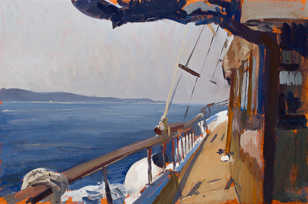
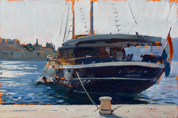
Bow of the Aurum. 20 x 30 cm, oil on panel.
I spent the last week cruising around the islands of the Dalmatian coast with my gallerist Ann Long, her husband, and some friends. Before photography it was normal for British and American travelers in Europe to take a painter with them to record the trip.
The mechanics of painting on a boat took some getting used to. The boat turns a lot when at anchor, which restricts the choice of foreground. Then there is a lot of wind and the movement of the waves is annoying. Next, the decks of boats are notoriously fragile, so I had to be very careful not to get any paint on anything. I also cut corks to fit on the bottom of my easel so as to not scratch or scuff the deck. While I’m used to painting portrait commissions in houses where I have to be careful about my paints, the wind and the movement of the boat add new challenges. Later the crew explained that since it’s a working charter boat, their decks are designed to take any stains or damage as the crew will quickly sand it off.
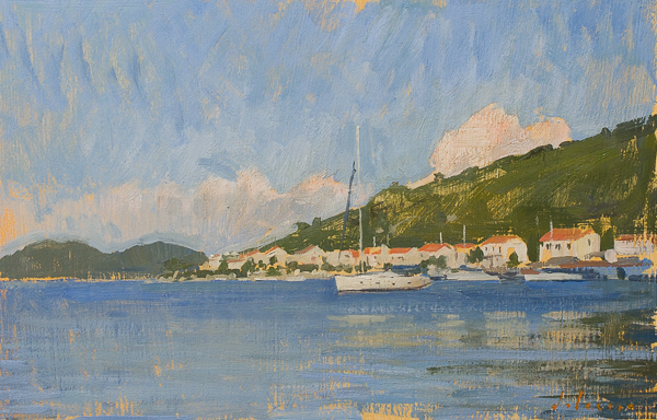
Morning Light, Šipan. 20 x 30 cm, oil on panel.
Two of my favorite plein air painters, Charles-François Daubigny and Edward Seago, both owned boats that they painted from. I was looking through their work before I left on the trip. One of the problems with painting from a boat is the foreground is always going to be water, which is a view that I don’t really associate with.
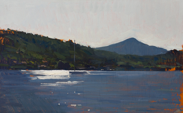
En Route to Vis. 20 x 30 cm, oil on panel.
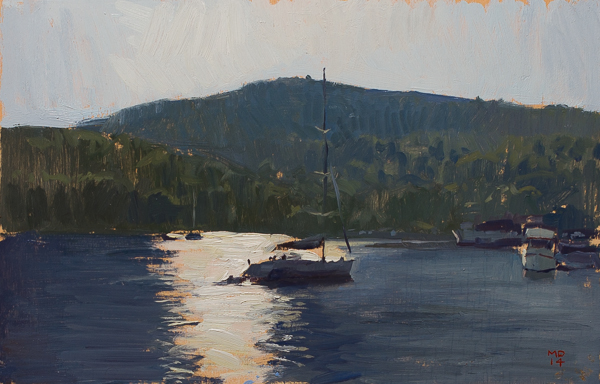
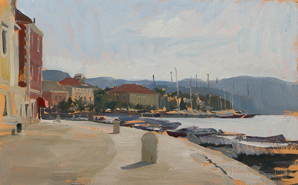
Afternoon Light, Vis. 20 x 30 cm, oil on panel.
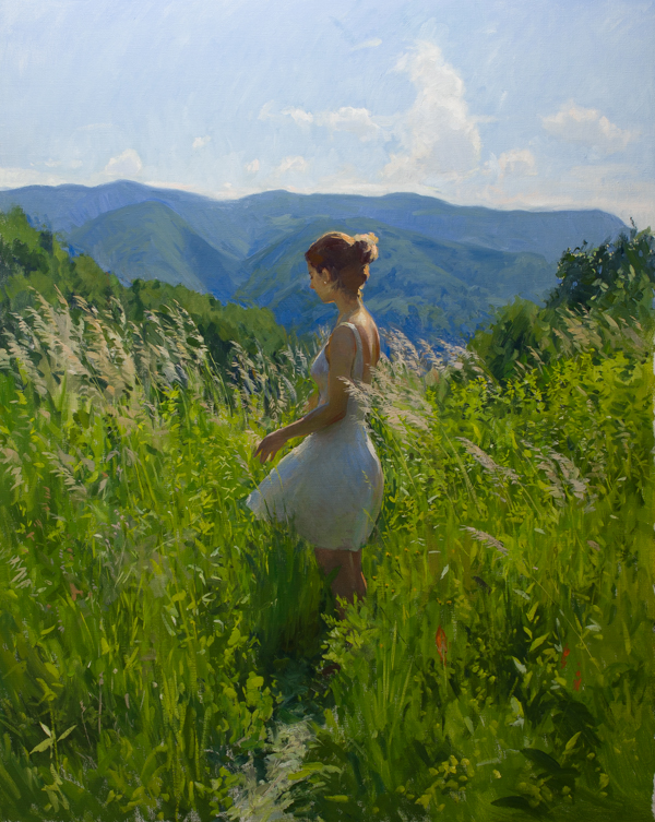
The rest are painted from solid ground on the various islands where we stopped.
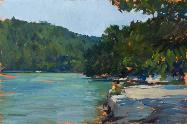
By the Lake, Mljet. 20 x 30 cm, oil on panel.
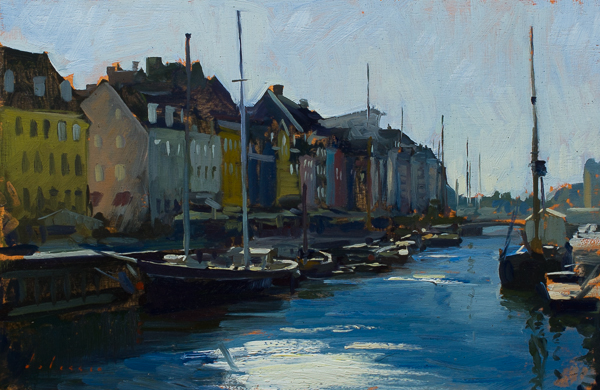
The Aurum in Korcula. 20 x 30 cm, oil on panel.
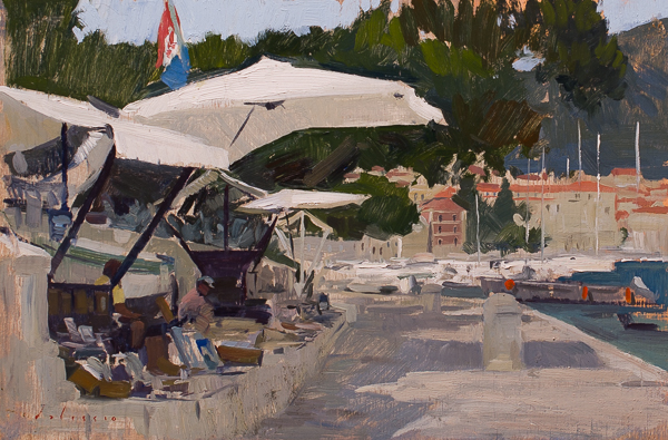
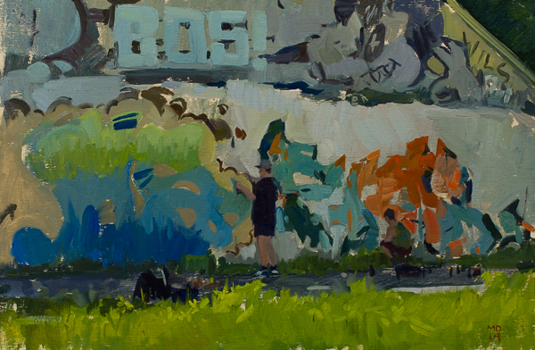
Tourist Stands, Hvar. 20 x 30 cm, oil on panel.
Sailboat, Mljet. 20 x 30 cm, oil on panel.
Hydrangeas, Korcula. 30 x 20 cm, oil on panel.
Hvar. 20 x 30 cm, oil on panel.
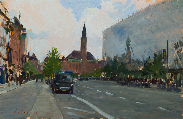
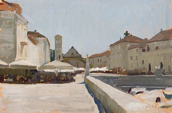
Stari Grad. 20 x 30 cm, oil on panel.
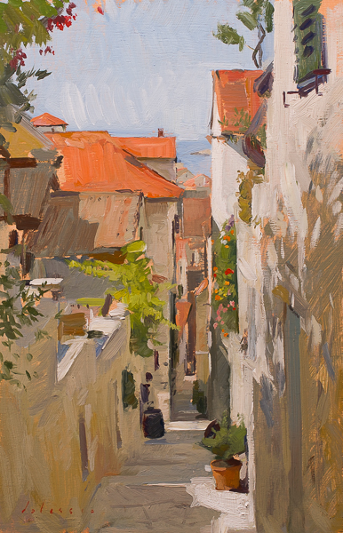
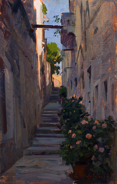
Street in Hvar. 30 x 20 cm, oil on panel.
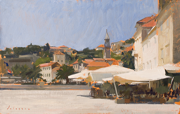
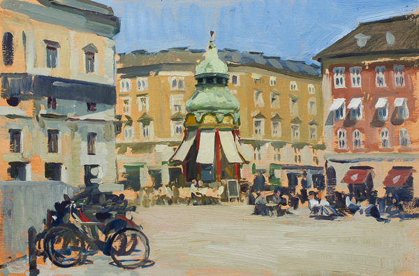
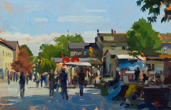
Cafes, Hvar. 20 x 30 cm, oil on panel.