Previously I wrote about using a mirror to correctly see shapes while working from life. This is a short post on the usefulness of painting with with your work upside down when inventing subject matter in the studio.
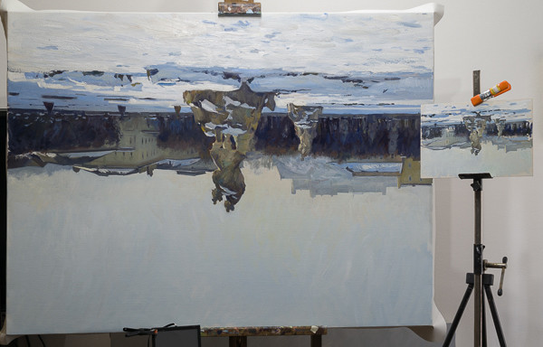
I’m currently in the process of enlarging some small plein air sketches from my Austrian trip into polished studio pieces. Much of the work requires, to some extent, inventing my subject. I find that flipping the painting upside down and observing the work free from the recognition of the objects helps me to quickly see some types of errors. Proportions and edges, especially, are two things that become easily noticable. In the gif below, the ‘before’ image shows how I originally painted the Hohensalzburg fortress above Salzburg as it appears in my sketch. Flipping the work upside down I immediately saw how the ‘steps’ were all exactly the same, so I shortened the bottom one, and raised the top one, to remove the repetitiveness.
Keeping variety in one’s edges is also important in painting. Surfaces that turn away from the viewer generally need a softer edge, elements where we want a focus are often given a sharper edge. Variety along the same edge can add interest to a work. As with repetition in shapes, turning the painting upside down makes it immediately obvious where the problems are with regards to the edges in the work.
It’s always been interesting to me how much of learning to paint is trying to rewire the way our brains see the world. In part this is because human beings evolved to see in an environment very different from the one we live in now. One of these adaptations is that our brain looks for patterns constantly, and my own observation is that seemingly unimportant areas in our vision, when painted, are forced into repetition that doesn’t exist in nature. For example, my students will paint every tree in a line of cypresses in Italy as being exactly the same: Tree, tree, tree, tree. The same goes for the shapes of a distant mountain. The line intervals are often drawn as being exactly the same, even if the direction of the line changes. In both cases, careful observation (or me pointing it out) shows that the cypresses are very different from each other, or that the segments of the line describing the outline of a mountain are very different, one from another.
From reading scientific theories about why this is, it appears that our brain filters out the ‘unimportant’ stuff by not focusing on the subtle differences in similar objects. This was in order to focus on things like predators, which would have been much more important for most of our evolution. This filtering out takes the form of generalizing individuality in aspects of the visual world. Part of learning to paint a landscape is learning to recognize this and focus on capturing exactly that variety in nature that our brain tries to ignore.
Another good example is the way students being taught cast drawing have to be told over and over to not look into the shadows. Once upon a time, looking into shadows was probably a very good idea for survival. In naturalistic painting, however, looking into shadows and painting the subtle differences usually results in an exaggeration of those differences when seen in relation to the whole image. It distracts the viewer’s eye (perhaps because their focus on what is in the shadow is compounded by the painter’s focus on what is in the shadow) and breaks up the sense of atmosphere of the work. ‘Less is more’ is the usual guideline when looking for detail in the shadow passages of a painting.
Turning one’s painting upside down forces the brain to see the subject as a series of abstract shapes. Without the immediate recognition of the objects, it becomes easier to see some of the basic pictorial rules being broken in our work.
Lastly, in the studio where I trained as a portraitist in Florence it was standard practice to keep the work in progress upside down on the walls so our eyes wouldn’t get used to them. The idea was that if we saw the paintings all day while we weren’t working on them, the images would some how be imprinted in our minds, and it would be harder to see the mistakes later while the work was next to the model. Today I still keep my work in progress upside down while not being worked on for this reason.
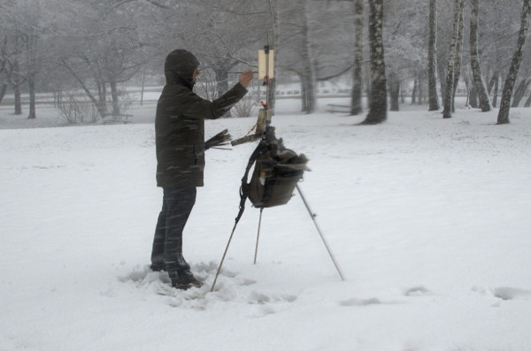
I love painting snow scenes outdoors in the winters, but I really, really hate being cold. I also struggle to work when I’m uncomfortable, and I believe painting is difficult enough even in the most controlled of situations.
Picking the right gear for plein air painting can be a problem as most winter outdoor gear is made for hikers or skiers/snowboarders, where the wearer will be moving a great deal. The manufacturers’ ‘minimum temperature’ is based on a much more active user than the average plein air painter, and I find that for standing still for hours in the snow means you pretty much have to double the listed temperature range on clothing. Ice-fishing and hunting forums are great places to research winter plein air gear, as they tend to have similar needs to us.
For staying really warm the key is lots of layers. Sierra Trading Post has a good guide to layering. Their interest in layers, however, is on being able to remove them when one warms up. I find I rarely remove a layer while plein air painting as I’m gradually getting colder the longer I stand still. The layering is important to me for getting warm enough in the first place. The downside with lots of layers is that movement gets harder, and for painting one doesn’t want to feel restricted in their arm movement. After painting for hours in multiple layers I get really sore shoulders.
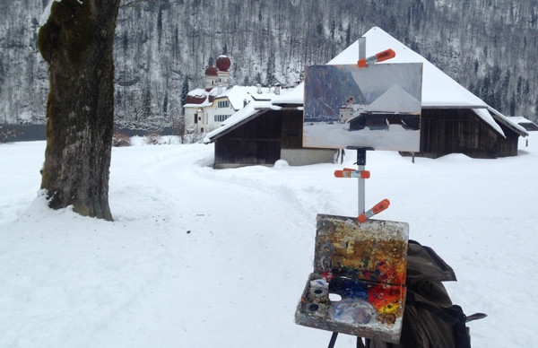
Plein air at painting St. Bartholomew’s Church, near Berchtesgaden, Germany.
The last two weeks I was painting outdoors in Austria and Bavaria in below-freezing temperatures and really suffered from the cold due to poor equipment planning on my part. I had to stop painting a couple times due to the cold, and I was often tense and stiff from standing still for hours without a proper kit on. Over the course of the trip I gradually picked up the gear I needed to work comfortably.
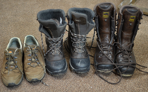
Three seasons worth of plein air painting footwear.
My old, cheap, pair of hiking boots weren’t waterproof enough for the amount of snow we found. After struggling a couple days with wet, very cold feet and trying to find some decent winter boots locally, I ended up just driving to the Meindl factory in Kirchanschöring, Bavaria, about half an hour north of where we were staying. I have a pair of Meindl hiking shoes which I’ve worn every day for a few years now and they’re still in great shape (on the left in the photo above). They were also really comfortable from day one and this trip I didn’t want to waste time breaking in new shoes. Furthermore, because of all the scouting I was doing by car, I wanted a smaller winter boot that I could wear while driving. Having a large choice at the Meindl store in the small town was perfect. In the end I picked up their Garmisch Pro GTX (in the middle in the photo above). The trade-off for being able to drive safely is that they’re not as warm as the pac boots that most winter plein air painters wear. These Meindls keep my feet warm in snow for over an hour, but after that I start to feel the cold. On the other hand, they’re such comfortable and well-made footwear that I later drove back and picked up a pair of Dovre Extreme boots (far right in the photo) for the rest of the year.
From people who know much more about standing still in cold weather, Stapleton Kearnsrecommends the Trans-Alaska III Pac Boot from Cabelas, and the Baffin Polar Series are recommended on ice-fishing forums. I hate the idea of buying shoes online, so I’ll look at them in stores when I’m over in Canada this August. Amazon also sells boot blankets, which get high praise from hunters, though I would think painters who stand would move too much and wear them out.
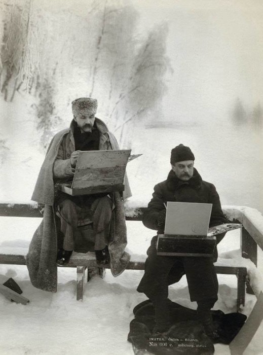
Another idea I’ve seen on ice-fishing forums is to take a piece of styrofoam to stand on to keep the shoes from touching the ice. Leo Mancini-Hresko uses the mats from his car for keeping his feet from touching the snow for the same reason. (In the photograph from 1893 posted below, Finnish painters Akseli Gallen-Kallela and Albert Edelfelt are clearly keeping their feet off the snow as well.)
Finnish Painters Akseli Gallen-Kallela and Albert Edelfelt Painting in the Snow in 1893.
For socks I was using Salewa and Meindl merino wool hiking/hunting socks. The Salewas kept their shape better, but the Meindls were warmer. When it was really cold I put Little Hotties handwarmers in the toes of the boots and, for those times, I preferred the thinner Salewa socks. Good American sock brands I see recommend are Darn Tough and Point6. Electric, heated socks are always tempting too.
I find keeping my feet warm to be the most important thing in winter plein air painting.
For baselayer leggings, I have a pair of merino wool bottoms from Patagonia which have worked well in the past. This year I somehow forgot them while packing and could only find the synthetic ones available in the local stores. The synthetic ones supposedly work well for activities such as hiking or climbing, but for standing still they’re a disaster. I layered two pairs and still felt the cold in my legs. Winter hunting forums recommend First Lite, Ibex, or Icebreaker for merino wool baselayers. (Many are on sale at the moment, if you can find your size). In past winters I’ve always worn snowboarding shells over my regular pants and usually never had problems with cold legs.
For me, the upper body is the easiest part to keep warm. Even though my current Patagonia parka isn’t great for really cold days, I find that with enough sweaters on it works. I also have a Patagonia down ‘shirt’ (really just a lightweight down jacket) which I use as a mid-layer when it’s really cold. As I said above, wearing lots of layers makes it more difficult to move your shoulders to paint. Someday I’ll pick up a dedicated painting jacket, one that is both really warm and allows a great deal of mobility, something like the Arc’teryx Ceres, or Rab Neutrino, but I’d like to try one on before dropping that kind of money. The really warm jackets which allow great mobility get really expensive really fast. I also dislike the really bright colors that much of this gear comes in. I paint often in city centers in Europe in the winter, and I try to attract as little attention as possible while I’m working (something like this, as tempting as it is, I feel is out of the question). More importantly though, the bright colors can reflect back onto the painting while working in the sun, which affects the way one sees their colors. I find muted colors in the middle value range, or blues, are the best for shirts, sweaters and jackets.
For my hands, I find any decent winter glove works on my left hand where I hold my brushes. On this trip I was using a cheap, lightweight wool glove without problems. On my painting hand I can’t wear a glove and paint comfortably, but I find my hand gets cold after a while. My solution is to carry a Hibbard Mitten in my pocket and put it on when I feel the cold. During those periods I’ll work on areas which don’t require much precision and after a few minutes my hand is usually warm again, and stays that way for a while. When it gets cold again I rinse and repeat. If there is a wind or it is really cold I can do a whole painting wearing a Hibbard Mitten, but I prefer not to.
For my neck I wear an old cashmere scarf and never have issues with cold on my neck. A good neck-gaiter would probably be a better idea as the scarf can sometimes come lose and hit your palette. I’ve also looked into balaclavas, and will pick one up to try, though it will probably be a good idea to keep the face open while painting in cities.
Hat-wise, my wool fisherman-style hat worked fine this trip. For anything colder a fur-lined bomber hat would probably work better. Though if things get that cold I’ll probably paint from a heated car, or through the window of the hotel or house where I’m staying. When it’s snowing heavily I put the hood on my parka up and it’s designed to stick out from my face quite a bit and keep the snow off.
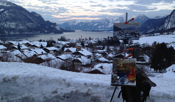
Plein air painting above St. Gilgen, Austria.
Also, when it’s snowing heavily I use an umbrella from Easyl to keep the snow off of my palette and the painting. I’d like to thank whoever left it in my car, it works great.
I’ve read that other painters have problems with their paint stiffening up with the cold. I’ve never had this issue. My Williamsburg titanium is a little bit stiffer perhaps, but nothing unmanageable. The only real difference I find painting outdoors in the snow is that I go through a lot more white and ultramarine.
If anyone else has any ideas or suggestions, I’d love to hear them. I’m still trying to figure this out.
A short post on using an Iphone as a black mirror. Like most of my tips, this is not my idea and I understand this has been common practice for a while at the ateliers like the FAA which teach sight-size. I mentioned it to other painters who hadn’t thought of the idea and it was well-received, so I decided to post it here.
I made the following video a few years ago demonstrating the use of a mirror in sight-size portraiture:
And in the next video of Ben Fenske painting a landscape you can see how often an artist will reach for the mirror while working:
The fact is, the mirror is one of the most efficacious devices for checking shapes and proportions in painting. It can be used without sight-size, but having everything visually locked-in makes the mirror especially powerful as an artist’s tool. For commissioned portraiture, where speed and accuracy are so important, it is really essential.
In landscape painting, artists will often use welding glass (sometimes called a black mirror) as it also greatly reduces the values. This allows the painter to see a value range closer to what they can actually capture in paint, and simplifies the number of values they need to compare.
Enter the Iphone, the $700 black mirror.
The Iphone has a flat, black glass screen and works perfectly for measuring shapes, proportions and values while landscape painting. Most of us also carry our phones around with us all the time. I recently inherited an older Iphone to replace my Nokia. While I’ll miss the maps and the privacy of my previous phone, I hated the rounded screen as I couldn’t use it to check shapes. Since I often forget, lose or break my painting mirrors when I travel, it will be a nice upgrade (that and the fact that iOS supports Instagram so I can stop borrowing the wife’s phone to post).
Update: I recently came across this quote from Leonardo da Vinci in his Treatise on Painting:
It is an acknowledged fact, that we perceive
errors in the works of others more readily than in
our own. A painter, therefore, ought to be well
instructed in perspective, and acquire a perfect
knowledge of the dimensions of the human body;
he should also be a good architect, at least as far
as concerns the outward shape of buildings, with
their different parts ; and where he is deficient,
he ought not to neglect taking drawings from
Nature.
It will be well also to have a looking-glass by
him, when he paints, to look often at his work in
it, which being seen the contrary way, will appear
as the work of another hand, and will better shew
his faults. It will be useful also to quit his work
often, and take some relaxation, that his judgment
may be clearer at his return ; for too great apph-
cation and sitting still is sometimes the cause of
Gregurić Breg (unfinished). 100 x 80 cm, oil on linen. Painted with the new medium from Blue Ridge Oil Colors.
Blue Ridge Oil Colors is going to start pre-making the medium I use and selling it in the US. (For people in Europe who don’t want to make their own, I would recommend getting it from Zecchi). If you want to make your own I also have a youtube video showing the process.
I was trying it out recently on this large plein air figurative piece, and in my sketches from Copenhagen. The Blue Ridge version dries faster than what I’m used to using. I know that’s a plus for a lot of artists and it certainly is for me when I travel. During longer projects though, like the one posted above, I sometimes like to scrape down a fresh painting at the start of the next session, and this medium dries too quickly for that -just a heads up.
The recipe is a variation of the medium developed by Charles Cecil and is originally based, in part, on the writings of Theodore de Mayerne. De Mayerne was a Swiss doctor who was friends with Peter Paul Rubens and Anthony Van Dyck. He wrote one of the rare documents discussing painting materials of the 17th-century, and he appears to have consulted with both Rubens and Van Dyck regularly on their opinions. His writings discuss straw-colored Strasbourg turpentine and thickening oil with lead in the sun, as well as many other art material related topics. You can buy an English translation online.
While I much prefer the smell of Strasbourg turpentine to Canada balsam, the Strasbourg turpentine sometimes beads a lot when beginning again on a dry painting. (Looking closely at Isaac Levitan’s paintings you can see the same beading, which makes me wonder what he was using).
At any rate, it’s a great medium for laying-in (add some turpentine), as well as glazing at the end of a project. I’ve been using it for over twenty years now and my early pieces are all in fine condition.
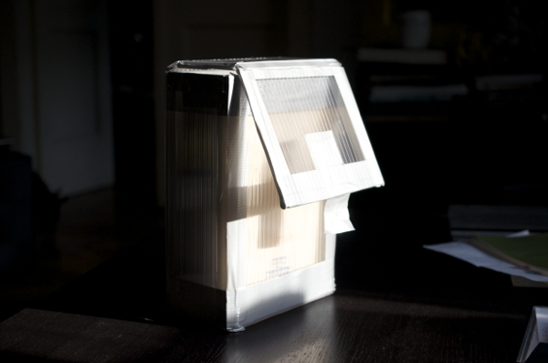
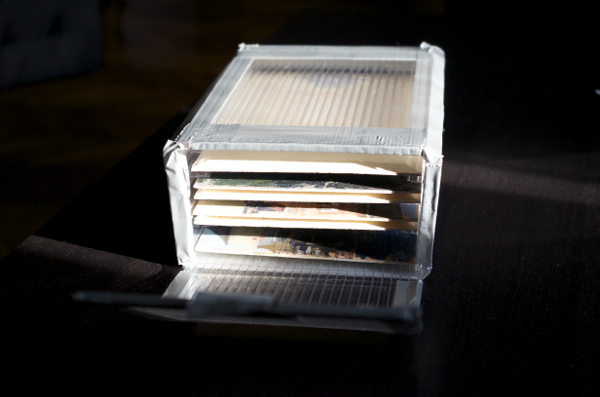
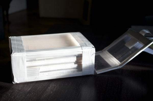
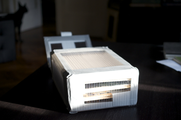
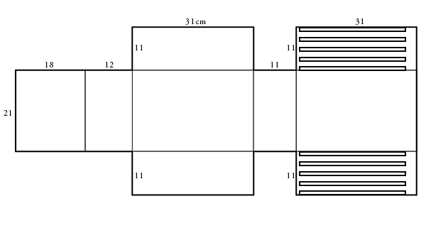
Ray Mar Art Supplies makes these great wet panel carriers for plein air painters. Unfortunately they’re only available in inches. I tried to get Sandro at Zecchi to make them with centimeter sizes but no dice. Since I’m about to go painting on a boat for a week I decided to make my own with that hollow plastic sheeting they sell at hardware stores, and I just copied the Ray Mar design (actually my wife figured it out, I discovered I can’t visualize a 3D object as a flat shape).
Here are few pictures of it:
And here is the design, for 20 x 30 cm panels, if anyone wants to make their own. I just sealed it up with electrical tape, and made the slots from slices of the plastic sheets. I would get a medium thickness for the plastic, the one I used was the full-sized one and it’s too thick. Also, next time I would rip up an old CD case for the slots to hold the panels.