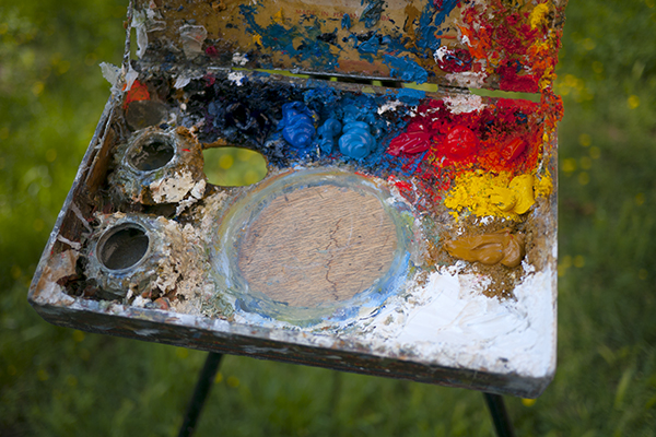
My ultra-portable cigar box palette.
I’ve been asked a few times lately what my palette is, so I thought I’d put a post about it.
(Updated in 2020:)
Outside:
- Titanium white, from either Williamsburg.
- Cadmium Yellow Light from Williamsburg.
- Cadmium Yellow Medium from Williamsburg.
- Zecchi’s Roman Ochre.
- Cadmium Red Light (Vermilion substitute), from Williamsburg.
- Cadmium Red Medium from Williamsburg.
- Cadmium Orange from Williamsburg.
- Cerulean Blue, Williamsburg, Zecchi, or Old Holland if I’m felling flush.
- Ultramarine Deep from Old Holland.
- Cobalt Blue, either Old Holland, Williamsburg or Zecchi.
Inside I use Lead White, and Ivory Black for portraits and still life.
Sometimes I glaze my landscapes or portraits with Alizarin, from Williamsburg.
The palette I started with included Naples Yellow, an earth red (Pozzuoli, English…etc), and Veridian. I have also used high chroma purples for specific projects with irises and such.
Hi Marc
Which brands did you used for Naples Yellow,earth red and Viridian ?
(for NapYells I use Harding,for earth red and Viridian I use Blockx,
or I grind my own including Cobalt Blue deep)
Thanks
ly
I only ever used hand-ground colors back in the days when I used Naples Yellow, earth reds, and Viridian. Zecchi sold a beautiful Naples back then, but like all their lead colors, their supply dried up and the other options at the time were unacceptable.
I’ve heard good things about the Harding Naples, I just find I never use it when I have it on my palette these days.
Hi Marc,
It is interesting that your using lead less.
I still use it and I also use Titanium in a mix with lead and by itself. I can’t shake lead…
I always thought that Cadmium’s a real Vermilion were just as toxic as lead.
Manganese is also not very good for you.
Lovely landscapes by the way.
Thanks Jeff.
I find that I don’t use nearly as much vermilion, cadmium, and manganese as I do white. So the other colors don’t bother me.
I just go through tons and tons of white, and so much of it goes down the sink when I wash brushes that I thought I was better off using titanium.
They use it in food coloring after all, it can’t be all bad.
There aren’t really substitutes for the other colors, but titanium is actually manageable when you get used to it.
I was just curious why you felt the need for the 4 different blues? Is it to paint the variety of greens outdoors? Thanks
Hi Stephan. Cerulean and ultramarine are essential (IMO). Cobalt just saves time, though you can get brighter skies with it as well. A pthalo blue is fun for greens and some colors not occurring naturally (i.e. cars or buildings).
And what about the Manganese blue? I’ve never used that color, although maybe you are talking about the hue which seems to be an altered Thalo?
I was researching artists palettes lately and just noticed that many artists palettes are top heavy with reds (including mine) and noticed yours had more blues then average. And since I admire your work very much I was curious. I guess in the end it is probably the individual eye of each artist choosing what they feel they need to use to match color or create the harmonies they want….
BTW, your most recent post on materials convinced me to upgrade on paints from my usual Utrecht to Blue Ridge. The money difference isn’t that great and it was sure nice to actually talk to the guy making the paints when I ordered!
I very much appreciate your thoughts and process from the classical sense and Italian influence, also studied at theAcademy many moons ago,. Do you always use your medium to strat works and use more ratio of medium to larger works for covering and flow. Surprised by using white, always thought it chalk the brilliance of colours.
Thanks for your sharing of process
Thank you! So helpful!!